Client
Female Cycle / www.femalecycle.dk
Year
01/07/2024
Female Cycle is a newly established company founded by three women, focusing on women's health and menopause. They wanted a visual identity that was both feminine and embodied strength, with a color palette that was fresh and modern, with references to medicinal products.
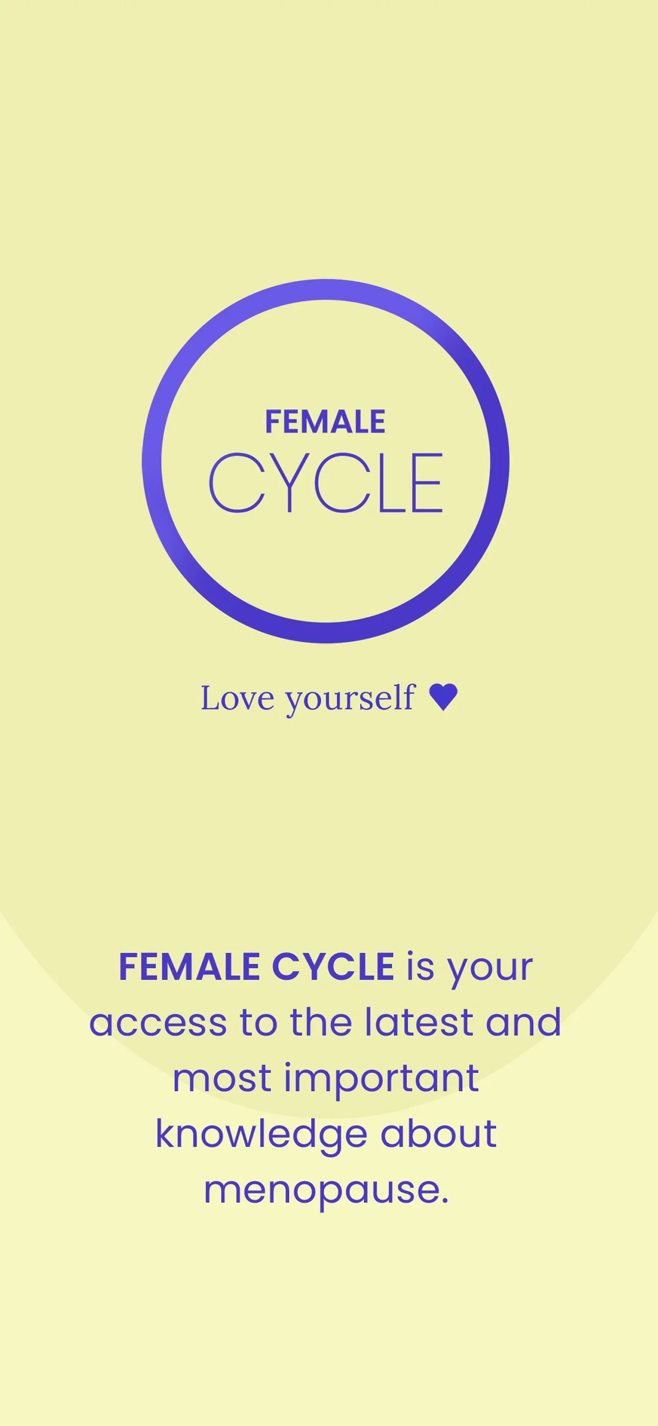
Since the company serves as an umbrella for other product lines, the logo needed to be easily recognizable—even without the brand name—and illustrate the cyclical nature of life as well as women’s biological cycles.
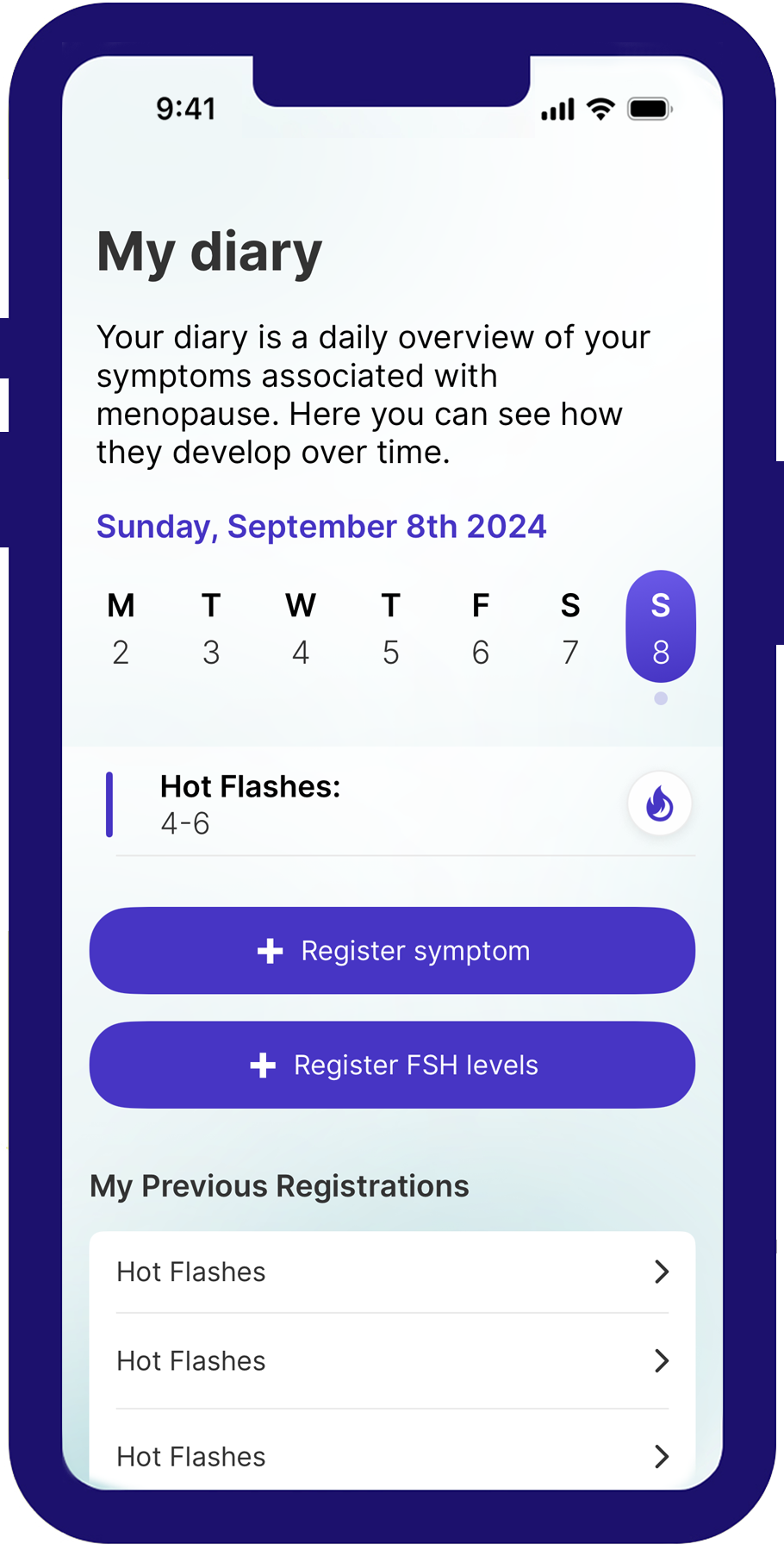
The project primarily focused on designing an app that tracks and provides information about menopause symptoms, in addition to developing the visual identity. It also included the design of a website, social media templates, and various promotional materials."
Colors
SoMe
Icons used in the app for menopause symptoms
Screens from the app
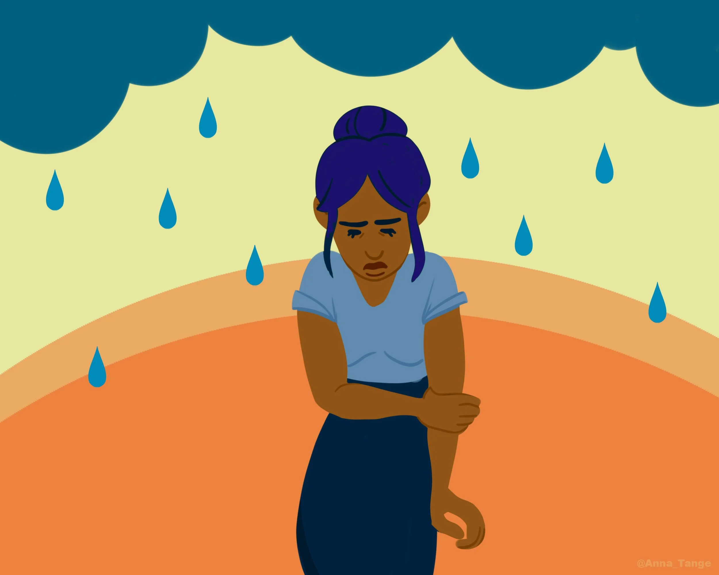
Illustrations for menopause symptoms in the app
by Anna Tange


